LINCOLN CENTER FOR THE PERFORMING ARTS
NEW YORK STATE THEATER (aka THE NEW YORK CITY BALLET, aka DAVID H. KOCH THEATER)
Date: 1964
Architect: Phillip Johnson
Primary Style: Modernist
Façade (primary material): Travertine Marble
Stories: 6
(The New York State Theater was the only building in the original Lincoln Center plan to be completed within its budget.)

The New York City Ballet
History –
- New York State Theater was designed by Philip Johnson and completed on April 23rd, 1964.
- German stage engineer, Walter Unruh, and George Balanchine consulted on the project for stage and auditorium design.
- While the original design for New York State Theater was published in 1959, the Lincoln Center design team denied this proposal and a second scheme was published on June 26th, 1961. This design became the realized building.
- In 2008, David H. Koch, philanthropist, businessman, and chemical engineer, pledged a $100 million donation to the NYC Ballet for a renovation of the auditorium space and for general future maintenance. In 2010, JCJ Architecture completed this renovation. The building was consequently renamed David H. Koch Theater.
Original Design –
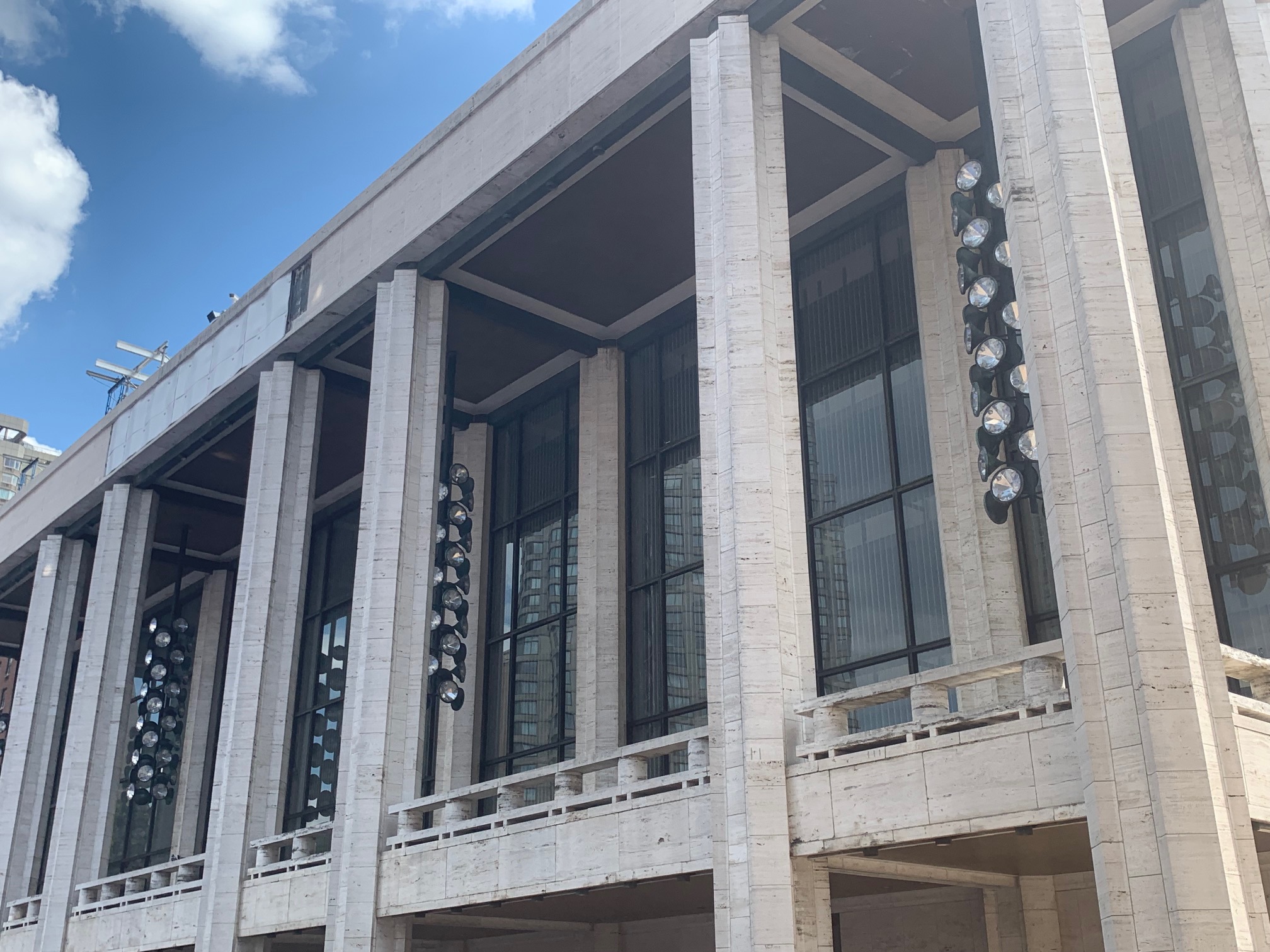
The design that Philip Johnson drafted for New York State Theater in 1959 was dramatically different than what was built in 1964. Johnson imagined a theater defined by its curved northern façade of floor-to-ceiling windows along Lincoln Center Plaza. A double-columned, cast concrete colonnade shrouded the entry but also continued around the other walls, surrounding the entire theater. While this design was received well by architectural critics, the Lincoln Center design team disapproved of this scheme. Lincoln Center felt Johnson’s original scheme altered the symmetry surrounding the plaza and was a more eye-catching design than the Metropolitan Opera House, which was intended to be the centerpiece of the complex. Consequently, New York State Theater did not follow Johnson’s original design. Then suggesting to connect New York State Theater across the plaza with Philharmonic Hall via a glorified arcade, Johnson was denied by Lincoln Center again. His third and final rendition of the scheme was approved in 1961, but to Johnson’s disappointment, he was forced to further conform to the vision of the Lincoln Center design team by borrowing elements from Max Abromovitz’s nearly finished Philharmonic Hall.
Philip Johnson’s New York State Theater does, in certain aspects, conform to the design precedents set by Philharmonic Hall, its neighbor across the plaza. However, through subtle design elements, Johnson was able to differentiate his work, arguably superseding Abromovitz’s aims. Johnson was required to conform to the greater dimensions of Philharmonic Hall. Johnson aimed to design his building closer to a classical composition. His travertine-clad, colonnaded northern façade was intentional in presenting its entrance onto the plaza. This is achieved through dividing the glass wall into a series of seven bays accented by four sets of columns. Additionally, an open-air promenade hangs above the entry at the second floor. Overhead, within the bays and above the promenade, hang tantalizing, bulbous chandeliers. These exclamatory exterior lighting fixtures are viewed by some as Johnson’s ironic nod toward the haughty and conceded nature of Lincoln Center as a whole. However, the less cynical also praise these playful additions to this classical composition, likening them to joyful Christmas trees or a mythical cyclops. These whimsical fixtures provide nearly all the excitement for this exterior, however. All three other facades hardly feature a window, slipping back into Johnson’s classical rhythm, accented by modern pilasters. Upon its completion, New York State Theater’s exterior was applauded and condemned. It was considered too bold by some and not bold enough by others. Ultimately, Philip Johnson was disappointed by his own design. He argued that, through the confinements the Lincoln Center design team and the nearly completed Philharmonic Hall placed upon his process and vision, the building did not achieve the modern interpretation of classical forms he was striving for. However, New York State Theater remains a much-adored component of the greater Lincoln Center for the Performing Arts.
The interior of Philip Johnson’s New York State Theater is defined by its meticulously interconnected series of lobby spaces and swooping staircases. This interaction of forms and space is further complimented by the art that Johnson commissioned for the space. Six different pieces by contemporary artists were either purchased for or purpose built within the space. Most notably, Lee Bontecou’s sculptural wall relief 1964 and Jasper Johns’ sculptural wall relief Numbers occupy the eastern and western stairwells respectively. Henry-Russell Hitchcock, art historian and friend of Johnson’s, praised this composition, stating that the art populating the stair landings was reminiscent of “nineteenth-century academic architects.” The interaction of art and architecture within New York State Theater was widely celebrated. Through these stairways, attending balletomane rise from the low-ceilinged first floor lobby into the sprawling, high-ceilinged Grand Promenade, similar to that of Philharmonic Hall across the plaza. Nearly entirely clad in gold leaf, this space was designed to host large receptions and dinners with an attached commercial kitchen facility. The space is light-filled and airy with its north-facing window wall. The room is lined with three tiers of bronze-railed balconies. These balconies are also accented with intricate light fixtures and patterned gold mesh. The balconies attached to the rear wall of the auditorium make a sensuous curve toward the center of the space. For the glass walls, Johnson hung gold chain curtains as window treatments, reminiscent of the curtains he designed in conjunction with Marie Nichols for the Four Seasons restaurant in Ludwig Mies van der Rohe’s Seagram Building. The northern wall’s glass French doors give access to the exterior balcony overlooking the plaza. It feels nearly impossible to look down in a space with such volume that Time called it, “the perfect place to pop a champagne cork.” However, if the eye happens to travel downwards, a matrix of red Rosso Merlino and travertine marbles spans across the space, bringing a contrasting warmth to this incredibly majestic yet imposing space. Sculptor Ellie Nadleman designed a pair of nearly twenty-foot-tall sculptures of female figures to reside opposite each other in the east and west ends of the room. While these twin pieces received mixed critical reception, the interior public spaces of New York State Theater are regarded as highly successful due to their ability to lean into the natural austerity of the endeavor, while still lightheartedly bucking its modernist and classical tendencies.
The auditorium space was designed by Philip Johnson in conjunction with choreographer George Balanchine. The space incorporated a proscenium stage and arch in a classic “court theater” orientation. The horseshoe-shaped plan incorporated five levels of shallow, gilded balconies. Looking inward on the stage but also on each other, Johnson successfully captured the sentiment of ‘seeing, and being seen’ in these fine arts, performative settings. Accommodating 2,801 seats, people brought the space to life. The seating was arranged in a way unfamiliar to American audiences. Known as a “continental” seating arrangement, due to its origins and popularity in mainland Europe, it created intervaled aisle seating that filled the entire space. Designed to use the space efficiently and promote smooth circulation, this scheme ultimately fell short of its intentions. Audience members felt trapped in their seats. Because of this, despite functioning well for performers and directors, the space was poorly received by critics and the public alike. The decoration of this space further compounded the haughty nature put forth by the austere Grand Promenade and continental seating arrangement. Themes were carried over from the decoration of the Grand Promenade. Gilded, gold leafed surfaces dominated the space. The stage’s proscenium arch was a particularly eye-catching golden monument. While the faceted light fixtures found in the public spaces were retained in the auditorium’s design, additionally, a large cluster of sixteen gold leafed light fixtures hung from the center of the room, serving as a focal point for the design. Complementing the spaces gold accents, the walls were painted a dark red and the chairs were upholstered to match.
As a whole, New York State Theater has been both celebrated and condemned, and for largely the same reasons. Its sense of ceremony and grandeur have been applauded for upkeeping an air of cultural tradition, but equally denounced as socially barring the public that the building is meant to serve. Many felt this gleaming and opulent design was too far flung from Johnson’s roots as an International Style modernist. However, Phillip Johnson’s New York State Theater proved to be more valuable than the criticism that discredited it. His design, in its exterior and all of its interior spaces, placed theatergoers in the spotlight as much as the performers. The New York City Ballet has done nothing to change the building’s exterior or interior public spaces, other than upkeep. The auditorium design was retained for forty-six years, only being renovated in 2010 to improve the technical and acoustic qualities to modern standards. Despite its short comings, Philip Johnson’s New York State Theater has been heralded as a success.
Past Renovations –
In 2007, JCJ Architecture was hired to perform a comprehensive assessment of New York State Theater’s operational, technical, and acoustic performance. Due to the celebrated nature of the original auditorium design, the performance space had not received an upgrade since its original construction in 1964. As the home of the New York City Ballet Company and the New York City Opera Company (not to be confused with the Metropolitan Opera Company), both groups felt they had compromised concerning specific performative functions over the decades. Through their study of the space and consultation with the New York City Ballet, New York City Opera, and the City of New York, JCJ was able to create a design that would remediate many of the functional shortcomings of the outdated space and could be executed in a series of three phases that allowed both companies to continue operation throughout the process. At 2,675 seats, the theater’s capacity had to be lowered to accommodate the firm’s functional improvements, however, this was a beneficial exchange. New seats were installed with acoustic backing, the orchestra pit was expanded, an entire acoustical, lighting, stage rigging, and communications upgrade was performed, and ADA accommodations were integrated. Additionally, the dressing rooms were upgraded, and the public spaces were refurbished with historical accuracy. These upgrades retained the character and integrity of Philip Johnson’s original design while optimizing the space for performers and audience members. This renovation was made possible by David H. Koch’s donation of $100 million to the New York City Ballet. As a result, the renovated theater was named David H. Koch Theater.
Further Reading –
- Stern, Robert A. M., et al. New York 1960: Architecture and Urbanism between the Second World War and the Bicentennial. Taschen, 1997.
- JCJ Architecture. “David H. Koch Theater.” JCJ Architecture, www.jcj.com/project/david-h-koch-theater/.

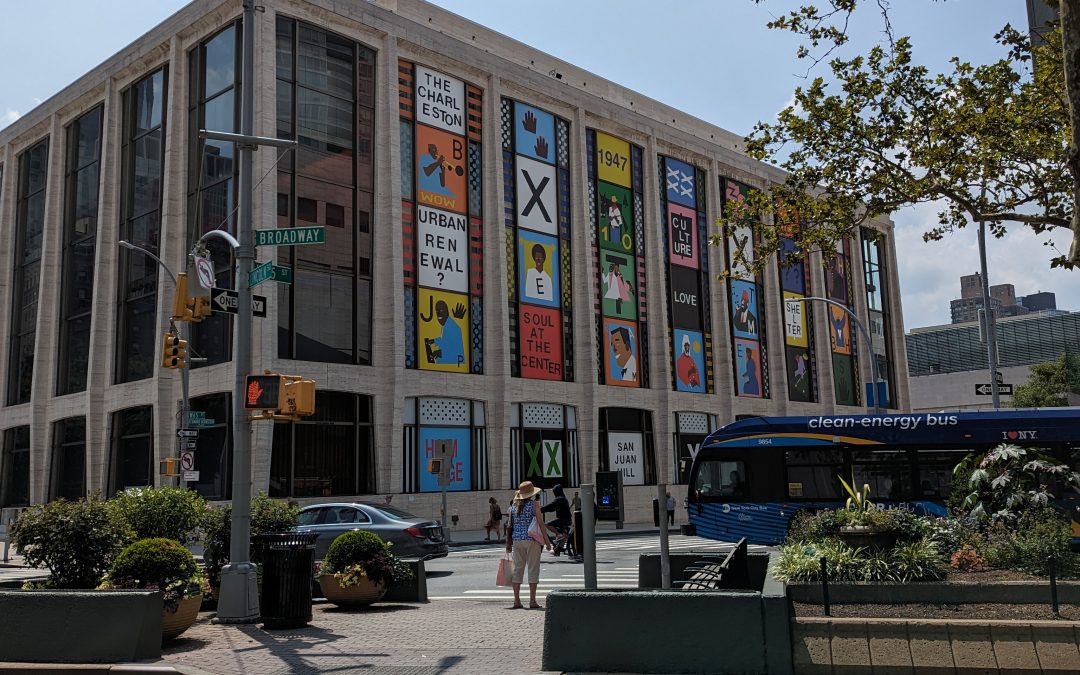
“San Juan Heal” Stands Out at Lincoln Center
by Sarah McCully It’s hard to miss the bright colors dotting David Geffen Hall’s typically neutral facade. Since early October of last year, the newly renovated concert hall’s northern windows have played host to a temporary art installation called “San Juan Heal” by...

Clouds de-Parting
Public art installations seem to be on attack, not just at Lincoln Center, but also, throughout the rest of New York City. The Museum of Modern Art (MoMA) has, for a long time, acted as a steward of Isamu Noguchi’s sculpture and other artwork. However, across the...

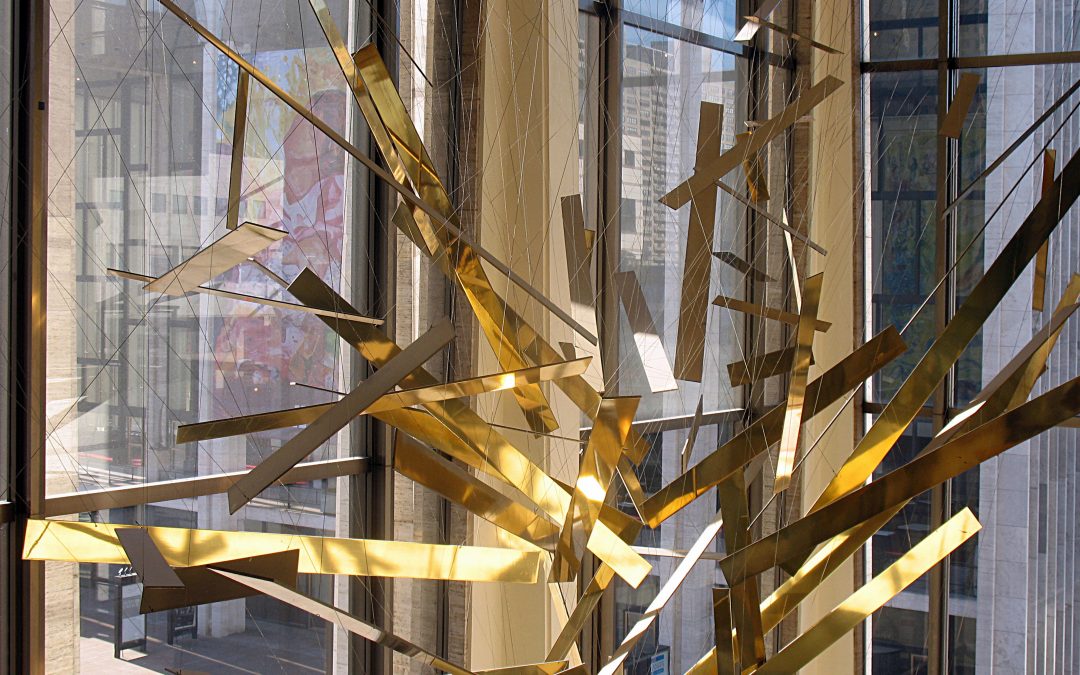
Seven to Save – UWS Gets Brassy with the PLNYS for the Richard Lippold Installation at Lincoln Center
Lincoln Center for the Performing Arts' Philharmonic Hall has felt empty since 2014, when Orpheus and Apollo, the shimmering and abstracted construction that has hung from the ceiling of the "grande promenade" since the hall was opened in 1962, was removed for...

Inside the Music Box
After some curveballs which were scrapped, The New York Philharmonic Hall, Avery Fischer Hall, David Geffen Hall at Lincoln Center is again in the news, and this time, it truly is what's on the inside that matters. Lincoln Center has announced that New York's own Tod...


